
Brand Guidelines
The power behind every pour.
This is the shared reference for how SOLID Concrete looks, sounds and shows up — the logo, typography, colour, imagery and language. Use it to make work that feels solid, precise and unmistakably ours.
Version 1.0 · Updated September 2026CONTENTSTen chapters
Start with strategy to understand what the brand stands for, then move through each element. Every chapter ends with the files you need.
01→What SOLID stands for and the idea every piece of work carries.
The identity at work — website, stationery, documents.
Symbol, logotype, lockups, spacing and the files.
Thmanyah Sans — one family for Arabic and Latin.
Solid Orange, Solid Black and the neutrals around them.
 06→
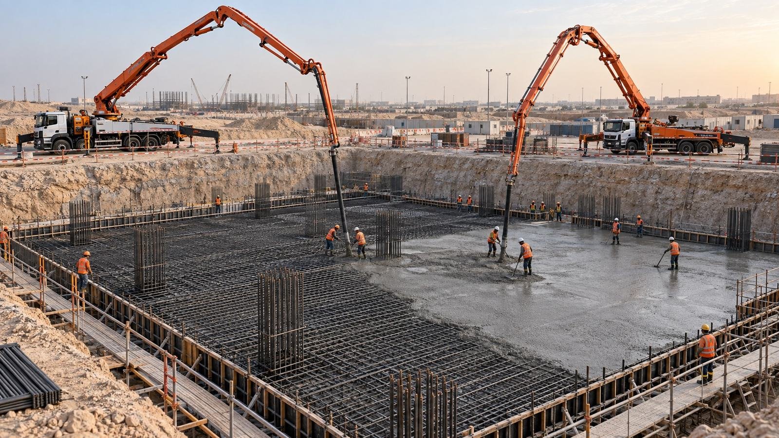
06→Real sites, real crews, honest light.
 07→
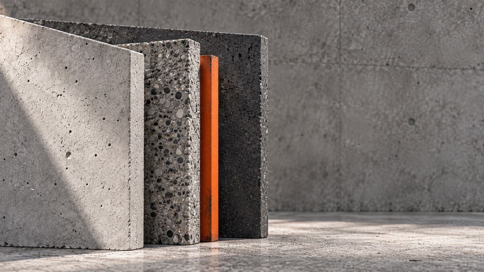
07→The 45° cut, the outlined symbol and quiet motion.
The symbol as an icon, and a line set for interfaces.
 09→
09→Direct, calm and accountable — in Arabic and English.
 10→
10→Every approved file in one place.
If you are unsure whether a piece of work represents SOLID Concrete correctly, ask before publishing.